Publisher's note: The author of this post is Dr. Roy Cordato, who is Vice President for Research and resident scholar for the John Locke Foundation.
1. Roy Spencer addresses critics
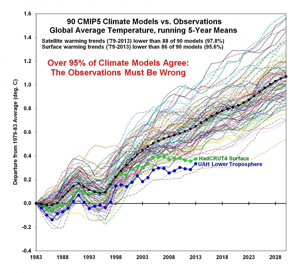
The graph below compares the temperature predictions of the major climate models to actual climate change figures using satellite data, considered to be the most accurate, going back to 1979 when satellite records began. The graph, compiled by University of Alabama at Huntsville climatologists Roy Spencer and John Christy, shows a huge disparity between projected and real temperatures suggesting that there is something drastically wrong with the models or maybe the modelers.
In
this blog post, Spencer addresses some major points made by critics of the graph. These are objections raised after a discussion of the graph at the conference of the Dutch equivalent of the American Physics Society. According to Spencer, they are objections made not by conference participants but by "activist bloggers." Here are the 5 objections that he has heard the most and have been relayed to him by the participant in the conference who presented the graph.
- They shift the modeled temperature anomaly upwards to increase the discrepancy with observations by around 50%.
- Using a four year baseline from 1979-83 shifts UAH down lower compared to the surface record.
- Why did John Christy use a four year baseline period instead of a 30 year baseline as is usual?
- One other trick played in the Spencer/Christy graph is to start all of the models from the same point. That's not what is done in practice — they are run-up over a period of time and have a distribution along the entire period.
- The baseline Christy used 1979-1983 is a 5 year period, it includes 79,80,81,82 and 83. It's basically the first point on his running 5 year mean. Of course that ISNT the 5 year average centered on 1983. It's the average centered on 81. So Christy's graph is shifted 2 years to the right.
Here is Spencer's response:
Now, see the text on the graph about how the warming *TRENDS* are almost always greater in the models than the observations?
Well, the difference in trends between models and observations is not affected by any of the 5 objections listed above.
It doesn't matter how you plot the data with vertical offsets, or different starting points: these issues do not affect the trends, and trends are probably the single most important statistical metric to test the models against observations.
The vast majority of the models have greater warming trends than the observational data show. How members of a Dutch "Physical Society" would not know any of this is beyond me.
Beyond this overriding issue which make the 5 objections moot, I will still answer them (in sequence, see above) because John Christy and I believe that the way we plot the data is the most physically meaningful and the most defensible.
- We do NOT shift the models upward to enhance the discrepancy with the observations. They diverge upward when starting at the same initial point: the 1979-1983 average (the first 5 years of the satellite record).
- See #1.
- The anomalies ARE relative to the same 30-year baseline. But when you plot the results, and the models have such a different warming trend, you then must decide whether to plot just the anomalies (which would have the models too COLD early in the record, then too WARM late in the record), or have them all start the "warming race" at the same time...like we did...relative to their respective 1979-1983 starting temperatures.
- See #3.
- Shifting of the year labels on the graph by 2 years has no impact on the discrepancy between models and observations.
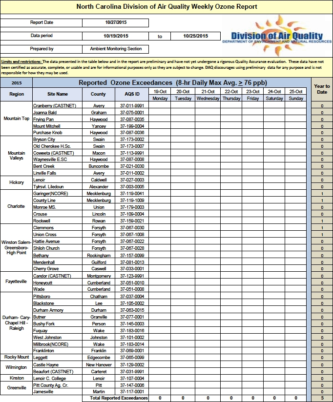
2. Ozone Report
The 2015 ozone season began on April 1 and, as I have been doing since this newsletter was started, each week during the ozone season this newsletter will report how many, if any, high ozone days have been experienced throughout the state during the previous week, where they were experienced, and how many have been recorded during the entire season to date. (Note: ground level ozone, which is what we are reporting on, is often called "smog.") According to current EPA standards, a region or county experiences a high ozone day if a monitor in that area registers the amount of ozone in the air as 76 parts per billion (ppb) or greater. The official ozone season will end on October 31. All reported data is preliminary and issued by the North Carolina Division of Air Quality, which is part of the state's Department of Environment and Natural Resources. There have been 5 high ozone days recorded on any of the state's 42 monitors. Three occurred on June 25 and 2 on August 5.
The table below shows all of the North Carolina's ozone monitors and the high reading on those monitors for each day of the 7-day period, October 19-25.